The rush to modernize a football club’s crest isn’t a simple design update; it’s a high-stakes gamble with the club’s most valuable asset: its identity.
- Prioritizing digital scalability over emotional history often leads to fan revolt and brand damage.
- Successful evolution requires cultural stewardship, not just marketing, treating the crest as a sacred symbol, not a logo.
Recommendation: Before any redesign, clubs must shift from a mindset of “rebranding” to one of “heritage curation,” engaging in deep, transparent fan consultation to ensure continuity.
In the relentless push for global relevance and digital optimization, football clubs are increasingly tempted to “modernize” their crests. The logic seems sound on a marketing spreadsheet: a cleaner, simpler logo is more versatile for social media avatars, more scalable for merchandise, and potentially more appealing to new, international “customers.” This perspective, however, treats the club’s badge as a corporate logo, an interchangeable brand mark to be refreshed like any other. This is a fundamental and often disastrous miscalculation.
For a supporter, a club’s crest is not a logo. It is a sacred symbol, a concentration of history, community, and personal identity. It’s the “portable piece of home” that connects generations of fans and represents the soul of a city. The common debate pitching tradition against modernity misses the point entirely. The real challenge is not a design problem but a profound exercise in cultural stewardship. When clubs pursue minimalist aesthetics by stripping away local symbols or complex heraldry, they aren’t just simplifying a graphic; they are amputating a piece of their identity and risking the alienation of the very community that gives the club its meaning.
This guide moves beyond surface-level design critiques to explore the strategic risks inherent in a rebrand. We will analyze why these projects so often fail, how to conduct a consultation that genuinely listens, and what it truly means to be a custodian of a club’s heritage. The central argument is this: successful modernization is an act of careful evolution that respects heritage continuity, not a disruptive revolution that chases fleeting trends.
This article provides a strategic framework for marketing directors, club executives, and supporters to navigate this complex terrain, exploring the critical balance between preserving a sacred past and building a sustainable future.
Summary: Rebranding Risks: A Strategic Guide to Crest Modernization
- Why Removing Local Symbols from the Badge Severs Ties with the City?
- How to Run a Rebranding Consultation That Actually Listens to Supporters?
- Global Logo or Historic Crest: Which Sells More Merchandise Locally?
- The Marketing Mistake of Prioritizing Digital Scalability Over Emotional Connection
- When to Announce a Rebrand to Minimize Negative Fan Reaction?
- The Design Error That Makes New Stadiums Feel Like Soul-less Bowls
- The Branding Error That Alienates Local Fans While Chasing Global Ones
- How Historic Clubs Survive Relegation Without Losing Their Community Identity?
Why Removing Local Symbols from the Badge Severs Ties with the City?
A football club’s crest is a visual contract with its community. It often incorporates specific, historically significant local symbols—a city’s coat of arms, a regional flower, or an industrial landmark. These elements are not decorative; they are the threads connecting the club to its geographical and cultural origins. Removing them in the name of a “cleaner” or more “globally understandable” design is not a simplification; it’s a disconnection. It tells the local fanbase that their specific history is less important than a generic, placeless appeal. This act can be perceived as a profound betrayal, severing the emotional ties that bind the club to its home.
As Dave Ellams, Creative Director at Conran Design Group, aptly puts it:
Football crests aren’t just identifiers, they’re emotional anchors. And if you treat crests (and clubs) like lifestyle brands in the hope of attracting new audiences, you risk stripping away the story. In designing for customers, you risk alienating the fans.
– Dave Ellams, Creative Director at Conran Design Group
The danger is not hypothetical. The backlash is often swift and severe, demonstrating the deep-seated value fans place on these symbols. When a club erases a piece of the city from its badge, it signals a shift in identity from a community institution to a detached corporate entity.
Case Study: Leeds United’s 2018 Rebrand Failure
In 2018, Leeds United unveiled a new crest for their centenary after a six-month consultation with 10,000 people. The design replaced historic symbols like the Yorkshire rose with a generic graphic of the “Leeds salute.” The fan reaction was immediate and overwhelmingly negative. A petition to scrap the new crest gathered over 77,000 signatures within days. The club, faced with a massive fan revolt, was forced to abandon the design entirely just six days after its launch. It stands as a stark lesson in how removing cherished local symbols, even after an extensive consultation process, can backfire spectacularly.
How to Run a Rebranding Consultation That Actually Listens to Supporters?
The phrase “fan consultation” has become a public relations shield, often used to justify a decision that has already been made. Many failed rebrands, like Leeds United’s, were preceded by extensive consultations. The crucial difference between a genuine dialogue and a token gesture lies in the process. An effective consultation is not a survey sent out to validate a pre-existing design direction; it is a foundational part of the entire strategy, starting before a single line is drawn. It must be transparent, inclusive, and iterative, treating fans as vital stakeholders, not as a focus group to be managed.
This approach requires clubs to surrender a degree of control, which can be daunting for a marketing department. However, the reward is a final design that carries the authentic endorsement of the community. In the UK, this is becoming a regulatory expectation; for instance, the proposed UK Football Governance Bill suggests that clubs must establish majority support (50%+) from fans for changes to the crest. This shifts consultation from a “nice to have” to a legal and ethical necessity.

The image above captures the essence of a meaningful engagement process: diverse groups of supporters collaborating, not just reacting. True consultation involves bringing different fan segments—from ultras to families to club legends—into the process at the very beginning to define the core principles and non-negotiable elements of the club’s identity.
Action Plan: A Framework for Authentic Fan Consultation
- Initiate Before Design: Start the consultation process before any design work begins. Engage with supporters, club legends, staff, and community groups to establish the core values and sacred elements of the existing identity.
- Ensure Professionalism and Transparency: Use a formal tender process to select a professional design agency, making it clear that their role is to facilitate the fans’ vision, not impose their own.
- Involve Diverse Stakeholder Groups: Go beyond season ticket holders. Actively include representatives from supporters’ trusts, academy players, long-serving staff, and local community leaders to get a holistic view.
- Publish Findings Openly: Share the results of surveys and workshops transparently with the fanbase. This builds trust and shows that feedback has been heard, even if not every suggestion is adopted.
- Create Iterative Feedback Loops: Do not present a single, final design for a “yes/no” vote. Instead, build in multiple review points throughout the process, allowing fans to see how their input is shaping the evolution of the design.
Global Logo or Historic Crest: Which Sells More Merchandise Locally?
One of the primary drivers for crest modernization is the belief that a minimalist, “global-friendly” logo will unlock new revenue streams, particularly in international merchandise sales. This logic pits the historic crest against a modern logo in a false dichotomy, assuming that what appeals to a potential new customer in Asia or North America is inherently at odds with what a lifelong local fan cherishes. The reality is far more nuanced. While a simplified mark might perform better on a digital banner, it often lacks the storytelling power that commands premium prices and drives loyalty in the core market.
The most successful clubs do not choose between global and local; they build a dual-range strategy. They understand that the historic crest is a premium heritage asset. Limited edition collections featuring a classic, detailed badge often sell out quickly at high price points to the dedicated home fanbase, who value authenticity and connection. Meanwhile, a simplified logo or brand collaboration can be used for lifestyle apparel targeted at a broader, international audience.
Case Study: Paris Saint-Germain’s Dual-Range Heritage Strategy
Paris Saint-Germain’s collaboration with Jordan Brand is a masterclass in balancing global appeal with heritage. The partnership, which achieved an incredible 3 million sales in 2024, created a new, global lifestyle brand without erasing the club’s core identity. PSG successfully maintains a dual strategy: modern, co-branded designs for international markets and fashion-conscious consumers, while continuing to offer merchandise with the traditional club crest for their core supporters. This proves that clubs can expand their commercial reach without sacrificing the historical mark that resonates most deeply with their local fanbase.
The pursuit of a single, “one-size-fits-all” logo is a strategic error. It undervalues the emotional equity of the historic crest and ignores the potential to serve different markets with different branding approaches. Heritage isn’t a barrier to commercial success; it’s a unique selling proposition that, when leveraged correctly, can be incredibly lucrative.
The Marketing Mistake of Prioritizing Digital Scalability Over Emotional Connection
The argument for minimalist crests is often framed in the technical language of “digital scalability.” A complex, detailed crest, the argument goes, does not render well as a tiny favicon or a social media profile picture. Elements like intricate lines, subtle color gradients, or small text must be sacrificed for a bold, simple mark that is instantly recognizable on any screen size. While there is a grain of truth in this design principle, it becomes a grave marketing mistake when scalability is prioritized over the very soul of the brand: its emotional connection with the fans.
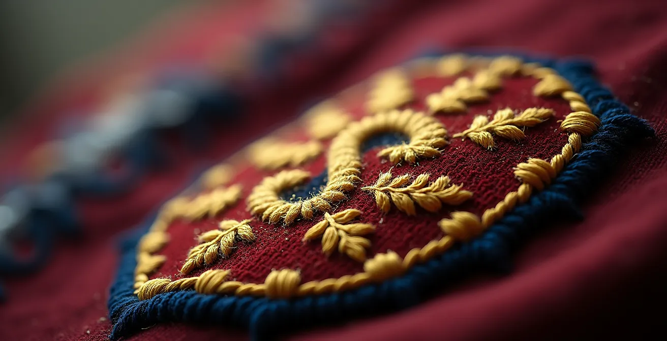
This technical-first approach led Juventus to its controversial ‘J’ logo. As one analysis noted, “The Bianconeri made the bold decision to move away from their traditional oval crest, replacing it with a stylised ‘J’. This groundbreaking change sent shockwaves throughout the football world.” It was a move celebrated in some design circles for its bravery but mourned by many fans for what was lost. The intricate details of a traditional embroidered crest—the texture, the craftsmanship, the history woven into its fabric—are not flaws to be optimized away. They are features that hold decades of emotional equity. When these are stripped for digital simplicity, the club risks trading its soul for a scalable asset.
The case of Everton provides an even more direct warning. In 2013, the club introduced a new crest that removed its long-standing Latin motto, “Nil Satis Nisi Optimum” (“Nothing but the best is good enough”), for the sake of a cleaner design. The backlash was immense, with a petition that garnered over 22,000+ signatures forcing a complete reversal. Fans did not care that the new design was “cleaner”; they cared that a core piece of their identity had been discarded for a minor technical benefit. It was a clear demonstration that emotional connection will always trump digital optimization in the hearts of supporters.
When to Announce a Rebrand to Minimize Negative Fan Reaction?
Even with a well-designed crest and a thorough consultation process, the timing of a rebrand announcement can make the difference between reluctant acceptance and outright hostility. A club’s identity is deeply intertwined with its on-pitch performance and its relationship with the fans at any given moment. Announcing a major identity change during a period of crisis—such as a relegation battle, poor results, or ownership turmoil—is almost always a recipe for disaster. In such contexts, a rebrand is not seen as a forward-looking strategic move but as a tone-deaf and insulting distraction from the “real problems.”
Conversely, timing the announcement during a period of success, such as after winning a title, can provide a cushion of goodwill. However, this also carries the risk of being seen as “ruining the moment” or arrogantly changing a winning formula. The most prudent approach is often to use the natural pause of the off-season. This provides a buffer period for fans to adjust to the change before seeing it on the pitch and separates the identity shift from the emotional highs and lows of the competitive season.
The following table, based on an analysis of strategic brand communication in football, outlines the risks associated with different timing contexts.
| Timing Context | Risk Level | Fan Reception Likelihood | Strategic Considerations |
|---|---|---|---|
| After Title Win | Medium | Mixed (60% positive) | Euphoria can cushion blow but risks ‘ruining the moment’ |
| Off-Season | Low | Better (70% acceptance) | Allows adjustment period before seeing on pitch |
| Mid-Crisis | Very High | Hostile (80% negative) | Seen as tone-deaf distraction from real problems |
| With New Ownership | High | Skeptical (65% negative) | Viewed as erasing history for commercial gain |
Case Study: Ajax’s Successful Heritage Return (2024)
In a move that bucked the minimalist trend, Ajax delighted fans in 2024 by announcing a special kit featuring a return to their detailed, classical portrait logo from 1928, moving away from the abstract line-art version adopted in the 1990s. The timing was masterful, coinciding with a renewed club focus on its world-famous youth academy and heritage. Fans “swooned” at the return to a more storied design, proving that strategic timing and a message of heritage continuity can generate immense positive sentiment—sometimes more than pushing forward with an unpopular modern design.
The Design Error That Makes New Stadiums Feel Like Soul-less Bowls
The identity crisis facing football clubs is not confined to the digital realm of logos; it is mirrored in the concrete and steel of modern stadium architecture. Just as crests are being stripped of their unique character for a generic, scalable look, new stadiums are often designed as “soul-less bowls.” They are engineered for maximum capacity, corporate hospitality, and multi-purpose functionality, but frequently lack the intimacy, character, and sense of place that defined historic grounds. These old stadiums were often embedded in the heart of their communities, with unique quirks and acoustics that gave them a distinct personality.
Modern stadiums, by contrast, are often built on the outskirts of cities, surrounded by car parks and retail parks. Their uniform, curved designs create a homogenous viewing experience, whether you are in London, Munich, or Dallas. The very design elements that make them efficient and commercially viable can also make them feel sterile and disconnected from the club’s identity. The passion of the fans is expected to fill the void, but the architecture itself offers little to inspire a sense of home or history.
This is where the crest’s role as a symbol becomes even more critical. In a world of increasingly generic stadiums, the badge on the shirt is one of the last remaining tangible links to the club’s unique identity. As Creative Bloq’s editorial staff noted, the badge is the anchor of identity when all else changes:
A football crest is more than pixels on a screen; it’s a portable piece of home. And while the game itself can change (think new owners, new leagues, new revenue streams) the badge is the one thing fans don’t want rebranded like a sneaker drop.
– Creative Bloq Editorial, Are football club logos facing a design crisis?
When a club inhabits a generic stadium and wears a generic crest, it risks a complete erosion of its unique identity. The mistake is the same in both cases: prioritizing functional efficiency over the intangible, emotional elements that create a sense of belonging.
The Branding Error That Alienates Local Fans While Chasing Global Ones
At the heart of most controversial rebrands is a fundamental strategic calculation: the decision to prioritize the acquisition of new, global “customers” over the retention of the existing, local “fans.” The logic is that the local market is saturated and loyal, while vast, untapped markets exist overseas. An academic analysis of Inter Milan’s rebrand strategy laid this bare, explaining that the goal was to “connect with ‘customers’ who are not yet interested in football.” This reframing from “fan” to “customer” is the critical error.
A fan’s loyalty is unconditional; it is part of their identity. A customer’s loyalty is transactional and conditional on performance or trendiness. By redesigning a crest to appeal to the latter, a club risks alienating the former. This is a high-risk gamble, as it trades a guaranteed, deeply invested audience for a hypothetical, fickle one. The financial power of a dedicated, traditional fanbase should not be underestimated. For example, a recent market analysis showed that Germany’s deeply rooted football culture generates €1.6 billion in merchandise revenue, accounting for 28.1% of the entire European market. This demonstrates the immense commercial value of a loyal, local fanbase.
The pursuit of the “uninterested customer” often leads clubs to strip away the very things that make them unique—their complex history, their local symbols, their traditional colors. In an attempt to be everything to everyone, they risk becoming nothing to anyone. As the academic analysis cited earlier on Inter’s strategy concludes:
In seeking to expand their market, Interbrand realized that targeting football fans who currently support another club would be difficult as fans are traditionally loyal to their first club. Hence, the brand strategy was to connect with ‘customers’ who are not yet interested in football.
– Academic Analysis, Kissing the badge: Club crests or corporate logos?
This strategy fundamentally misunderstands what makes football clubs powerful brands in the first place. Their power comes from their deep, authentic community roots, not from a generic, global appeal. Diluting the former to chase the latter is a strategic branding error of the highest order.
Key Takeaways
- A club’s crest is a historical asset with deep emotional equity, not just a scalable logo.
- Effective fan consultation must be an iterative, transparent process that starts before any design work begins.
- Prioritizing digital trends over heritage symbols risks alienating the core fanbase and destroying brand value.
How Historic Clubs Survive Relegation Without Losing Their Community Identity?
The ultimate test of a football club’s identity is not its performance in a top-flight league or its global brand recognition; it is its ability to survive adversity. Relegation is a commercial catastrophe, wiping out revenue from television rights and sponsorships. Yet, for historic clubs, something crucial remains: the unwavering support of their community, anchored by the very symbols of identity that are so often threatened by modernization. When the money and glory fade, the crest, the colors, and the name are what endure. They are the rallying point for the community, the proof that the club is more than a business.
As one editorial powerfully states, “football clubs are more than just businesses. They are institutions of community pride and sentiment. Their names, crests, and colours are sacred symbols that carry the weight of history and the hopes and dreams of their fans.” This is why a rebrand that erases history is so dangerous—it weakens the very foundation that the club will need to rely on when times get tough.
Case Study: The Fan Revolt and Rebirth of SV Austria Salzburg
The most extreme example of identity survival comes from Austria. In 2005, Red Bull purchased SV Austria Salzburg and attempted a total corporate takeover. They changed the club’s name, its crest, and its historic violet and white colors to their own corporate branding. They declared it a “new club with no history.” The loyal fans revolted. Believing their club’s 72-year history had been erased, they formed a phoenix club, SV Austria Salzburg, starting from the lowest tiers of Austrian football to preserve the original identity. This powerful act demonstrates that a club’s true identity lives within its supporters and its symbols, and it can survive even the complete erasure of its commercial entity.
This is the ultimate lesson for any marketing director or owner considering a rebrand. The club’s identity is not theirs to remake; they are merely its temporary custodians. The true ownership lies with the community, and that identity is resilient enough to outlast on-pitch failure, financial hardship, and even corporate takeovers. The role of the club’s leadership is not to reinvent this identity, but to act as its faithful steward for the next generation.
To put these principles into practice, the next step for any club leadership is to conduct a thorough internal audit of its brand heritage, treating its crest and identity not as a marketing tool to be optimized, but as a sacred asset to be protected and curated.